Seattle Art Museum
A Voice led screen redesign for the SAM ticket purchasing flow
Roles- UX writer, Researcher, Usability
Problem
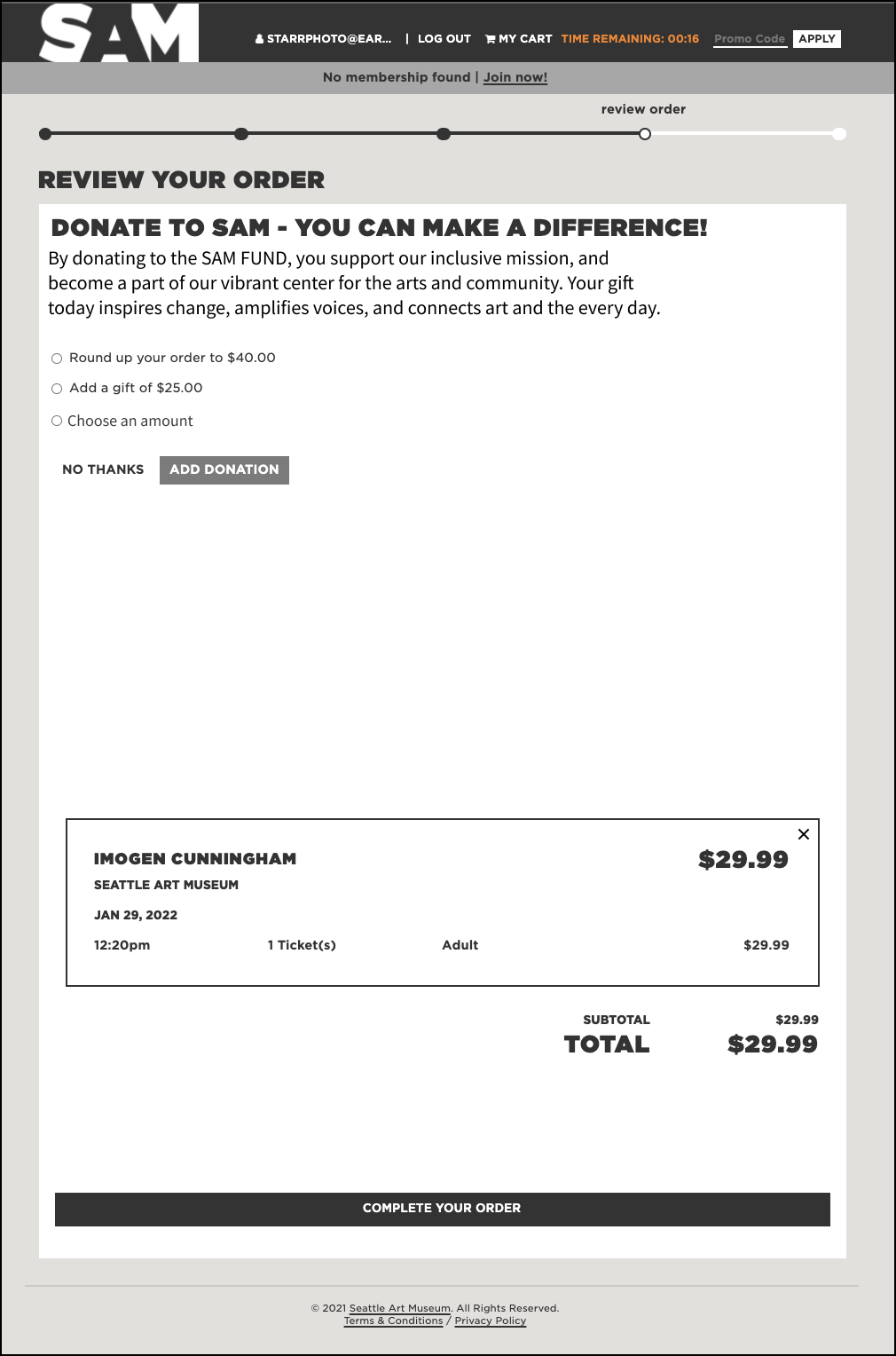
With too many screens to navigate, and a timed shopping cart function, it’s easy for some users of SAM to become frustrated, abandon, or time out on their task for purchasing a ticket to visit the Museum.
Solution
Streamlining the words.
This project shows how identifying and implementing the authentic voice of an experience is a powerful tool to move the user toward their goal.
We've all been there. Trying to achieve something quickly online, but failing. Too many screens to complete, a timeout, or both can be a roadblock. For this project, I wanted to apply UX writing to solve usability issues for a particular screen of the SAM ticket buying experience.
Process
My design process started with a general audit of the SAM website to discern their voice characteristics. Then specifically create a Voice chart to inform the word changes that would best support the institution.
I recognized three different product principles from the audit-
Inclusion, Inspire, and Stimulate Active Engagement.
From those principles I was then able to fill in the Voice chart.
Next, I created a page-specific analysis using the findings from the voice chart.
The copy on this page does not live up to good UX writing standards- that of text that is <50 characters wide, <4 lines long.
By applying the above voice chart to my analysis, I was able to make call-outs that could then guide my re-write while more closely mirroring stakeholder intentions.
*A conscious choice to omit the Covid-19 reference was made at this time, as we seem to be coming out of the pandemic.
My rewrite. Less characters per line, and five sentences of copy have become three.
The user should be moved further along their journey by having less copy to process, and it being delivered in a more authentic voice to the experience.
The organization may see more donations, with the reduced and improved for Voice text, as the user may be less likely to bounce past the content in their pursuit of a ticket.
Learned
The power of UX writing is not just in brevity, but authenticity. Some brands may need more words, but if done right they will still drive the user forward.
I learned you cant get there without really researching and understanding the brand. Doing a word chart leveled me up in identifying and applying brand voice to a project, and leaves an artifact that helps support the organization’s vision going forward.
Coming Soon
Redesigning the entire SAM ticket flow through a UX writing lens with usability testing.
Check back soon!


